The Power of Colors: How a Minimalist Palette Contributes to Space Optimization in Small Environments
The Role of Color in Space Perception
In today’s fast-paced world, maximizing every square foot in our homes has become essential. As many people find themselves living in smaller apartments or homes, the environments can feel cramped and overwhelming. The strategic use of color can be a game changer, significantly altering how we perceive and experience space. By understanding the psychological effects of different hues and employing effective color schemes, we can transform our living spaces into more inviting and functional areas.
The Power of Minimalist Color Schemes
Minimalist color schemes provide a powerful solution for small areas by creating a clean and airy feel. Techniques such as:
- Using soft neutrals like pale grays, whites, and beiges can promote tranquility and create an understated yet elegant backdrop.
- Incorporating light shades such as soft pastels or bright whites reflects natural light, making rooms feel larger and more open.
- Employing monochromatic designs in varying shades of a single color adds visual cohesion, allowing the space to feel seamless and organized.
For example, imagining a tiny studio apartment with walls painted in a subtle cream, accented with light woods and plush textiles in similar tones can create an inviting atmosphere that feels expansive rather than restrictive.
Psychological Impact of Color Choices
The impact of color is not just about aesthetics; it’s fundamentally tied to psychological effects and functionality. Colors like:
- Whites and creams can make a room feel larger by reflecting light, thus enhancing the overall brightness.
- Pale blues subtly expand the horizon, evoking feelings of calmness and serenity, ideal for spaces meant for relaxation.
- Earthy tones, such as terracotta or olive green, can ground a space, creating a sense of warmth and stability.
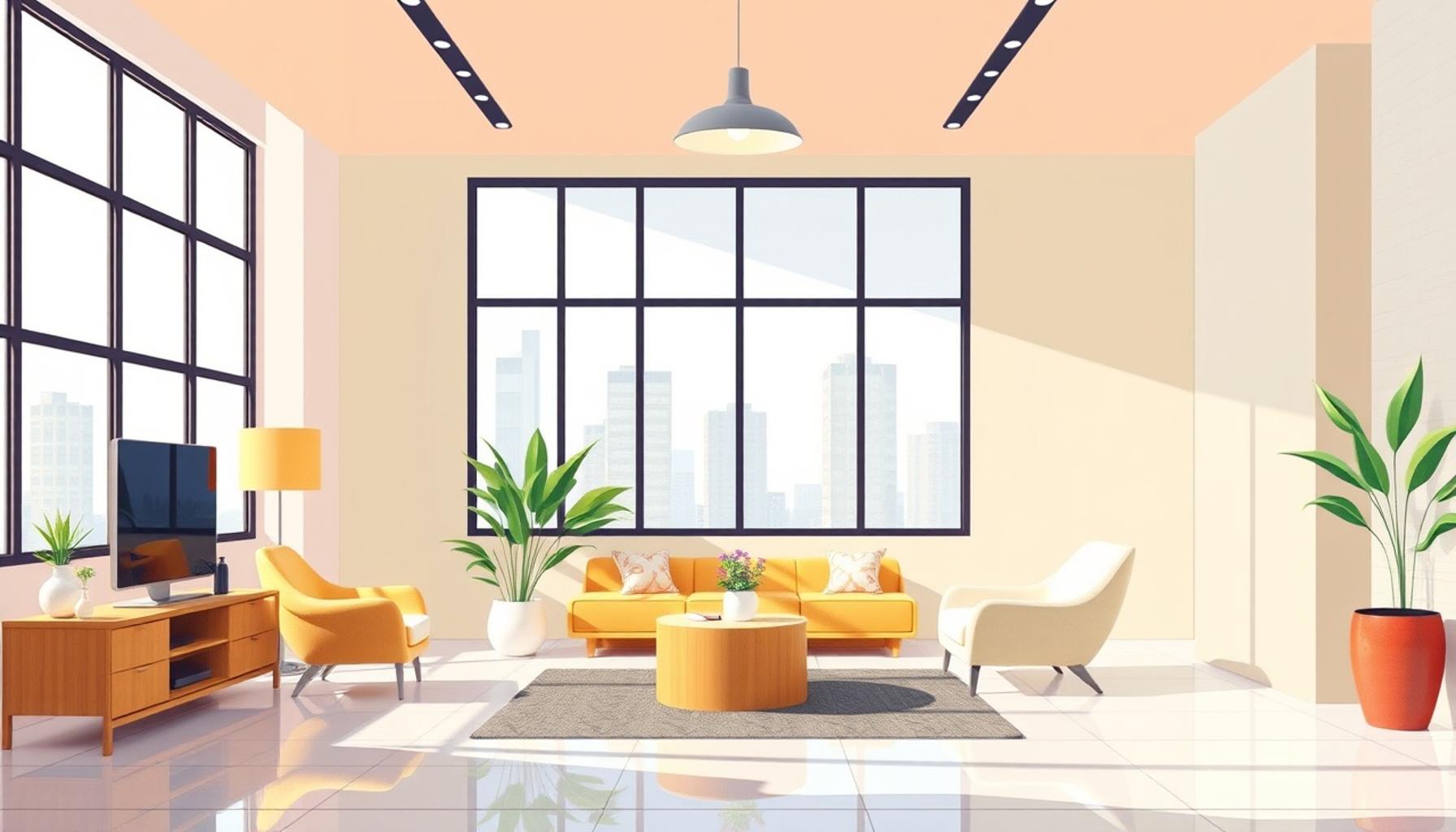
Consider a living room designed with an earthy palette paired with large windows. The warm tones combined with abundant natural light cultivate a space that feels both intimate and expansive, perfect for hosting friends or enjoying quiet evenings.
Aligning with Contemporary Design Principles
By adopting a minimalist approach to color, we can optimize the layout and utility of our small living areas. This method not only prioritizes open space but also aligns with contemporary design principles that value simplicity and intentionality. Trends in modern design emphasize the idea that less truly is more; the careful selection and application of color reinforce this philosophy.
As we delve deeper into the relationship between color and space optimization, we uncover the nuances that can transform our environments dramatically. Whether through paint choices, furnishings, or textiles, understanding how color interacts with space can empower us to create not just homes, but sanctuaries that reflect our personal aesthetic while maximizing every inch.
DON’T MISS OUT: Click here to discover how to create versatile environments
Exploring Color and Spatial Dynamics
The relationship between color and spatial perception is a profound aspect of interior design, especially when it comes to small environments. In compact living spaces, every decision counts, and the colors we choose can dramatically influence not just the appearance, but also the feel of a room. Color serves as a tool that can manipulate our senses, guiding our perception of the size and depth of a space. A deep understanding of how to utilize this power allows us to create settings that are more than just functional—they become extensions of our personalities.
How Light Affects Color Perception
The aspect of light in relation to color cannot be overstated. In intimate spaces with limited natural light, the choice of color becomes crucial. Walls painted in shades of white or light gray can amplify the brightness brought in by windows. This not only enhances visibility but also contributes to a heightened sense of openness. In contrast, darker shades, while rich and dramatic, can make even the largest of rooms feel confined and suffocating. Therefore, to maintain an illusion of space, many designers opt for a combination of:
- Soft creams and whites that reflect light
- Pale blues and greens that suggest freshness and airiness
- Light woods or pastels to manage the earthiness and warmth of the setting
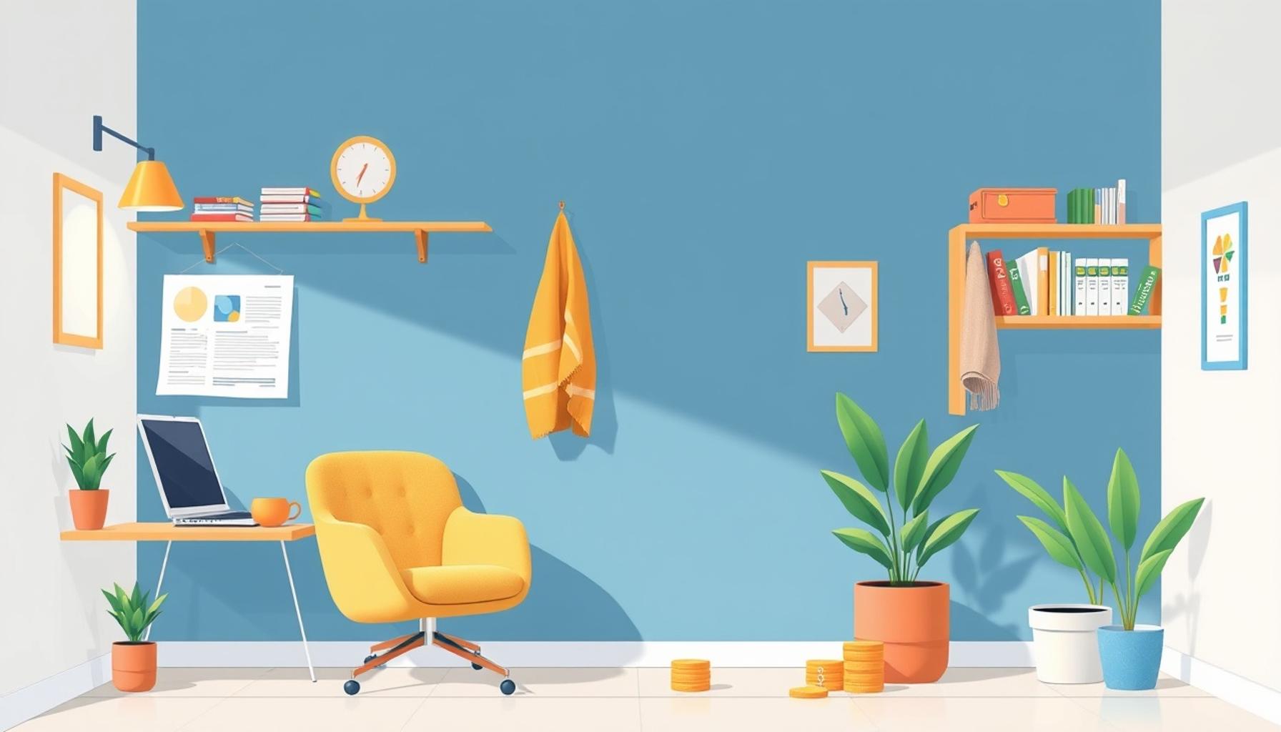
For instance, imagine a small office nook painted in a delicate sky blue. This subtle choice can invite tranquility, motivating productivity while still making the room feel expansive, a vital consideration in the hustle of modern work-from-home lifestyles.
Creating Visual Harmony with Color
When you embrace a minimalist palette, achieving visual harmony becomes an attainable goal. Monochromatic schemes are particularly effective as they maintain a singular tone throughout the space which can be enlivened with textures and materials. For instance, varying shades of soft gray can form an elegant backdrop when layered with textiles such as a plush gray throw or a woolen rug. Each hue complements the next, creating a feeling of cohesion and spaciousness. This approach contrasts sharply with busy, multi-colored patterns that can easily overwhelm smaller areas, making it difficult to establish a balanced and inviting environment.
By limiting the color palette, one can create striking focal points. For example, a single piece of art that pops in a vibrant hue against an otherwise neutral background can draw the eye and provide a sense of scale, enhancing the overall design without adding clutter or competing elements. This technique directs focus and adds character while respecting the spatial constraints of the area.
Embracing the Emotional Aspect of Color
Furthermore, the emotional aspect of color choices plays a significant role in creating the ideal small space. The colors we live with can affect our mood and overall well-being. Light, airy spaces adorned with soft hues can make us feel relaxed and uplifted, while darker, more saturated tones can evoke feelings of warmth and comfort. Understanding this relationship between color and emotion enables us to cultivate environments that enhance our daily experiences. By harnessing the power of color thoughtfully, we can create spaces that not only feel larger but also enrich our lives.
When exploring the impact of color on space optimization in small environments, it’s essential to consider how a minimalist palette can enhance the perception of space. A carefully curated selection of colors can make even the smallest rooms feel more expansive and inviting. Lighter hues such as whites, soft grays, and pastel shades reflect light, thereby creating an illusion of spaciousness. This effect is particularly beneficial in cozy living areas or compact kitchens where every square foot counts.
Additionally, employing a monochromatic color scheme can simplify the visual experience, allowing the eye to glide effortlessly across the room. This homogeneity fosters a sense of calm and orderly aesthetic, making smaller spaces appear less cluttered and more organized. By reducing the visual noise, homeowners can create an environment that feels more efficient and functional, even when dealing with limited space. Accentuating just a few key pieces with bold colors can add character without overwhelming the senses, balancing personality with practicality.
Another intriguing aspect is the psychological impact of a minimalist color palette. Studies show that colors influence emotions and psychological responses. For example, soft blues promote tranquility, while bright yellows exude energy and positivity. By strategically utilizing these shades, individuals can not only maximize the usability of their spaces but also enhance their overall mood. This dual benefit underscores the power of color in small environments, encouraging readers to delve deeper into how to utilize color effectively in their own spaces.
| Category 1 | Category 2 |
|---|---|
| Space Perception | Lighter colors enhance spaciousness and warmth. |
| Visual Clarity | Minimalist palettes reduce visual clutter for a more organized look. |
Exploring the intersection of design and emotion through the strategic use of colors can be incredibly rewarding. One can transform small spaces into not only functional areas but also serene sanctuaries. The intentional application of a minimalist color palette opens a spectrum of possibilities for those looking to enhance their living experience in constrained environments.
DISCOVER MORE: Click here to learn how to create minimalist spaces
The Role of Accents in Small Spaces
While a minimalist palette lays the foundation for an open and airy environment, the strategic use of accent colors can further enhance the perception of space. In small environments, pop accents serve both an aesthetic and practical purpose. The judicious application of color can create movement within a room, making it feel dynamic without overwhelming the senses. Think of bright cushions on a subdued couch or a vivid artwork hanging on a monochromatic wall—these accents can stimulate the space, offering visual breaks and reducing monotony.
Color Zoning for Functionality
One of the more innovative uses of color in small spaces is color zoning, where different colors define various functional areas within a single room. This technique not only helps in visually segmenting a space but also contributes to an organized and purposeful environment. For example, using a soft mint green in a kitchen area while opting for a warm beige in the adjacent living space can delineate the cooking and relaxing zones. This subtle shift in color signals a change in function and can make a small area feel more extensive by signaling to the eye that the space is multifunctional.
Psychological Impact of Color on Small Spaces
Delving deeper into the psychological effects of color, research has shown that certain shades can significantly affect behavior and interactions within a space. Consider the use of earthy tones; shades like terracotta and ochre can invoke feelings of warmth and community, ideal for small dining areas where gatherings occur. In contrast, cool colors—such as light blues and greens—often promote calmness. This is especially beneficial for small bedrooms or study areas, creating an atmosphere conducive to relaxation or concentration. Implementing colors with these psychological insights can not only optimize the aesthetic appeal but also enhance functionality, leading to improved experiences within small environments.
Natural versus Synthetic Light Considerations
Another important factor in color selection for small spaces is understanding how natural and synthetic light affects color perception. Rooms lit by natural daylight can exhibit different hues and shades throughout the day, leading to variations that can either enhance or diminish the space’s best features. For example, a soft gray may appear warm during the day but shift to a cooler tone during the evening under artificial light. Consider using warm-colored light bulbs in cozy corners or lamps to ensure that the colors in the room maintain their inviting nature at night. On the other hand, bright, cool light can enhance the freshness of lighter shades, making them a great choice for areas needing an energy boost.
Incorporating Color in Small Multi-Functional Spaces
More than ever, urban dwellers are confronted with the challenge of utilizing limited space effectively, often leading to multi-functional areas. Here, the power of a minimalist color palette becomes even more pronounced. By employing subtle transitions of color from one functional area to another, it’s possible to create a seamless flow while still signifying divisions. For instance, transitioning from pale yellow in a work area to soft white in a sleeping nook can encourage the idea of change without harsh lines or disruptive contrasts. This approach not only maximizes the visual space available but also promotes a sense of unity—essential in small environments.
Ultimately, harnessing the power of color within the confines of minimalism can transform small spaces into inviting, functional areas that not only look appealing but also serve their intended purposes effectively. By blending color’s psychological, spatial, and practical nuances, we can craft environments that celebrate both beauty and efficiency.
DISCOVER MORE: Click here to learn about optimizing your space
Conclusion
In a world where space is often a luxury, understanding the power of colors can unravel endless possibilities for optimizing small environments. A minimalist palette serves as a transformative tool that enhances not only the visual appeal but also the functionality of confined areas. By embracing light shades and harmonious combinations, we can evoke a sense of openness and tranquility, crucial for small living spaces. The intentional use of accent colors and color zoning further elevates these environments, creating visually distinct areas that maintain fluidity and purpose.
The psychological impact of color in small spaces adds another layer of depth to our design choices. Utilizing colors that promote calmness and warmth can deeply affect our interactions and overall mood, making a small dining nook or bedroom feel welcoming and serene. Furthermore, navigating how natural and synthetic light influences color perception allows for strategic planning that enhances the ambiance throughout the day and night.
As urban living trends continue to rise, especially in the United States, it becomes imperative to rethink the relationship between color and space. By harnessing the principles discussed, we can reclaim the potential of small environments, making them not just livable but truly inviting. In essence, the thoughtful integration of color within a minimalist framework can lead to transformative spaces that resonate with beauty and function, encouraging us to explore the rich tapestry of design possibilities awaiting discovery.
Related posts:
Smart Furniture Design: Creative Solutions for Compact Spaces
Vertical Gardens: The Integration of Nature and Space Optimization in Minimalist Environments
The Art of Decluttering: How to Optimize Space with Minimalist Principles
Functional Furniture: Innovative Designs for Space Optimization in Minimalist Homes
Vertical Storage: Utilizing Walls for Minimalist Organization
Digital Minimalism: Organizing Your Virtual Space for Efficiency and Clarity